How to Use the Style Guide
We suggest watching the video for better understanding and also reading this article to easily get started.
This style guide is designed for simplicity and flexibility. You can customize it effortlessly by adjusting predefined variables. Below is a step-by-step guide on how to customize each part of the style guide to fit your design needs.
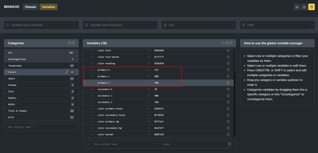
Changing the Primary Color
The primary color defines your brand’s main visual identity. To customize it:
Locate these variables:
--primary-h--primary-s--primary-l
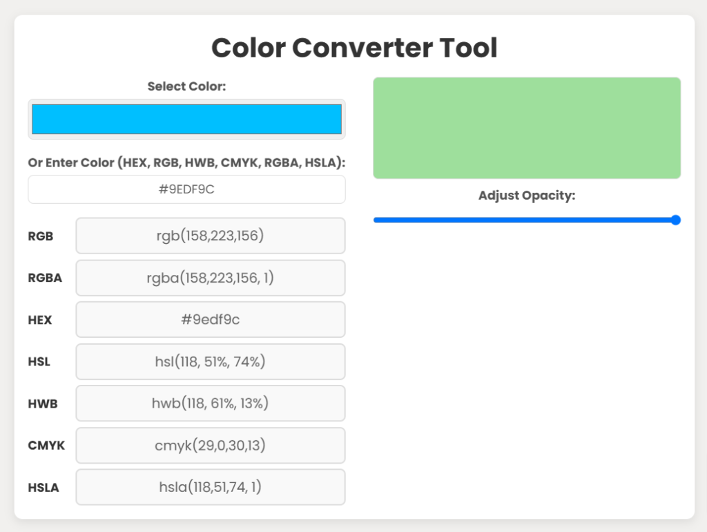
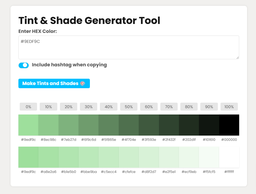
Convert your desired color (e.g., #9EDF9C) to HSL format. You can use any or this color converter tool.
Example: #9EDF9C → hsl(118, 51%, 74%)
Update the variables:
--primary-h: 118--primary-s: 51%--primary-l: 74%
The --color-primary variable automatically adapts using this formula:hsl(var(--primary-h), var(--primary-s), var(--primary-l))
All related tints, shades, and elements using the primary color will update automatically.
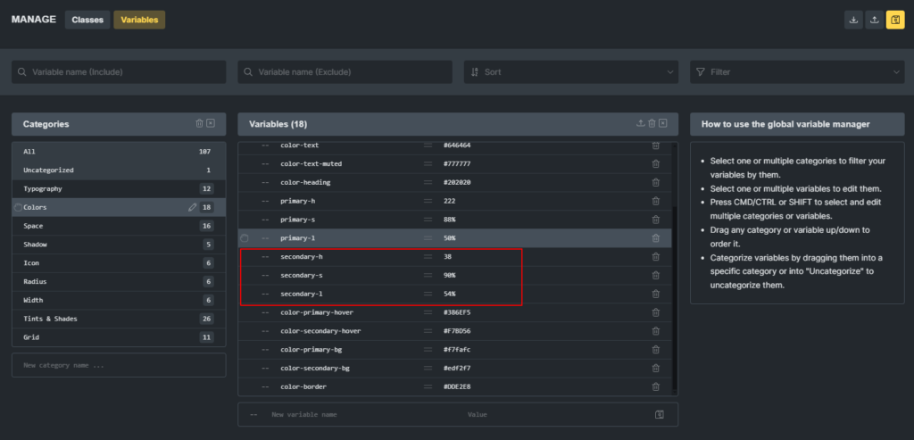
Changing the Secondary Color
Follow the same steps as for the primary color, but update the --secondary-h, --secondary-s, and --secondary-l variables.
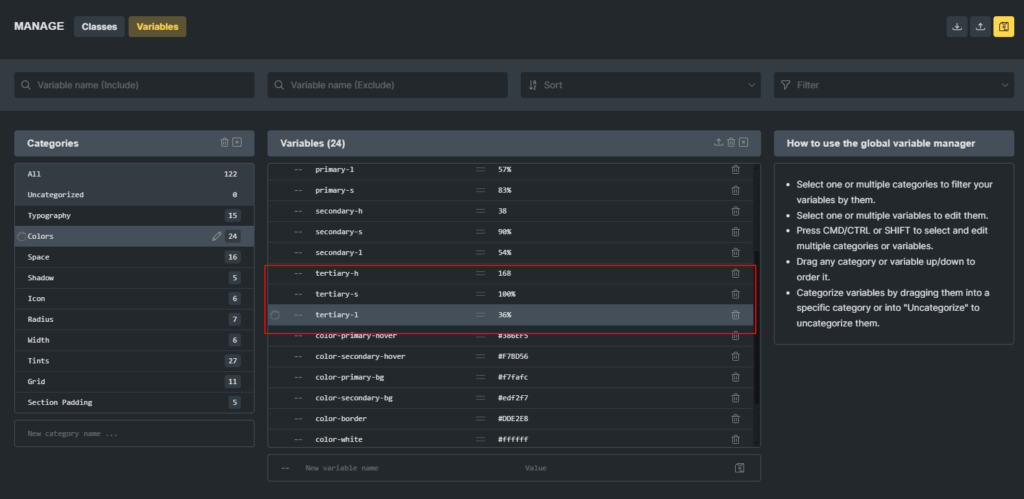
Changing the Tertiary Color
Follow the same steps as for the primary color, but update the --tertiary-h, --tertiary-s, and --tertiary-l variables.
Customizing Other Colors
To adjust other colors, directly modify these variables:
--color-primary-hover--color-secondary-hover--color-tertiary--color-heading--color-text--color-text-muted--color-text-dark--color-text-dark-muted--color-primary-bg--color-secondary-bg--color-border
Use tools like a color picker or a tint generator for better customization.
Typography
Headings
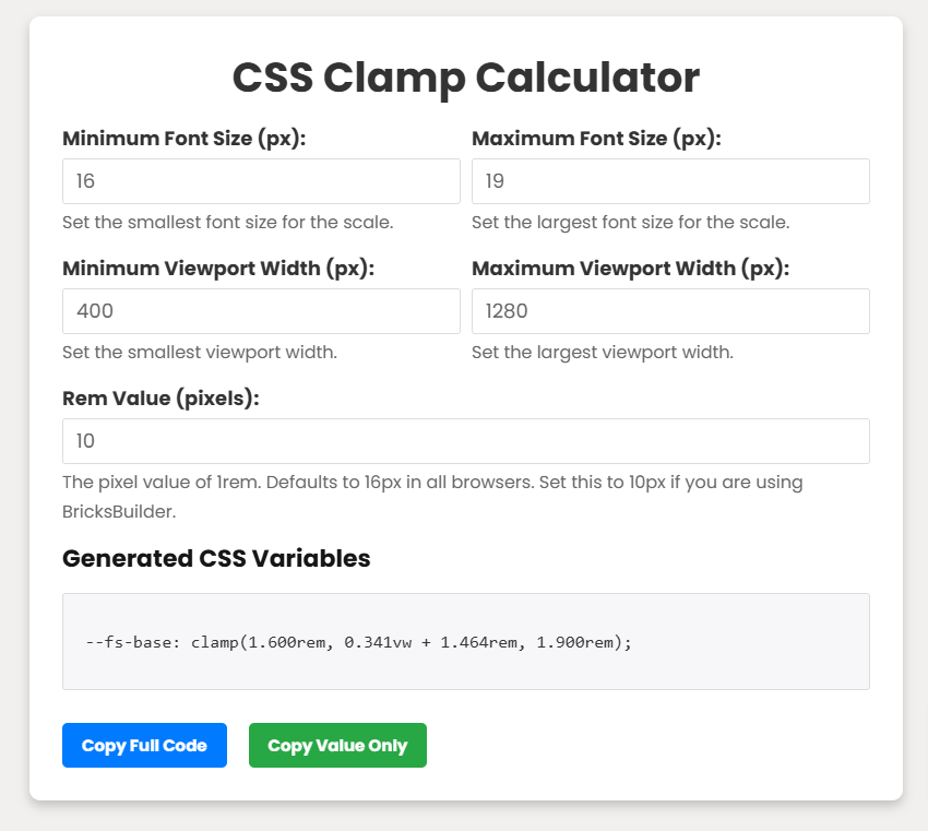
Predefined classes (.h1 to .h6) and variables (–h1 to –h6) are available for heading styles. Font sizes use the clamp function for fluid responsiveness. Adjust clamp settings with a clamp calculator.
Steps to Modify Headings:
- Define maximum size (desktop) and minimum size (mobile).
- Set
Rem Value (pixels): 10if the root font size is unchanged. - Paste the generated clamp value into the variable or class.
Text Sizes
Predefined classes (.text-xs to .text-xxl) and variables (–text-xs to –text-xxl) control text size. Variables and classes are fully customizable.
Body Text
Three predefined classes:
.body-text-s.body-text-m.body-text-l
Three predefined variables:
--body-text-s--body-text---body-text-
Use font weight classes (.font-200 to .font-900) for further customization.
Buttons
Button colors adapt automatically to the --primary-h, --primary-s, and --primary-l variables, and –secondary-h, –secondary-s, –secondary-l
Predefined button sizes:
.btn-xs.btn-s.btn-m.btn-l.btn-xxl
No additional changes are needed unless required.
Border Radius
Adjust these variables to customize the border radius:
--radius-xs--radius-s--radius-m--radius-l--radius-xl--radius-xxl--radius-50(for circular borders).
Shadows
Change shadow intensity by modifying these variables:
--shadow-xs--shadow-s--shadow-m--shadow-l--shadow-xl
Icons
Icon types: .icon, .icon-outline, and .icon-filled.
Icon sizes: --icon-xs to --icon-xxl.
--icon-xs--icon-s--icon-m--icon-l--icon-xl--icon-xxl
Width
Width settings can be adjusted using variables:
--width-xs--width-s--width-m--width-l--width-xl--width-xxl- –container-width
Space
Variables range from --space-7xs to --space-6xxl.
Grid
Available Grid Variables
This style guide includes 11 predefined grid variables for flexible layouts. You can use the following grid variables to create layouts with 2 to 12 columns:
--grid-2- –grid-3
- –grid-4
- –grid-5
- –grid-6
- –grid-7
- –grid-8
- –grid-9
- –grid-10
- –grid-11
- –grid-12
Section Padding
Adjust padding for sections by customizing these classes:
.section-padding-xs.section-padding-s.section-padding-m.section-padding-l
Adjust padding for sections by customizing these variables:
--section-padding-xs--section-padding-x--section-padding---section-padding-- –section-padding-lr (for left and right padding)
Padding values adapt responsively, ensuring consistency across devices.
Using the Clamp Function for Fluid Responsiveness
In this style guide, I use the clamp function extensively to ensure that elements in your design adapt fluidly to different screen sizes. The clamp function allows you to set a minimum, preferred, and maximum value for properties like font sizes, spacing, and other dimensions. This ensures that your design maintains readability and a consistent layout across all devices, from mobile phones to desktops.
Why Use the Clamp Function?
The clamp function helps create a responsive and adaptive design without the need for media queries or manually adjusting values for each screen size. It allows the element to scale fluidly, growing and shrinking based on the user’s viewport.
Here’s how it works:clamp(minimum, preferred, maximum)
- Minimum: The smallest value the property can be.
- Preferred: The ideal or default value that will be used for most screens.
- Maximum: The largest value the property can grow to.
Benefits of Using the Clamp Function
- Fluidity Across Devices: The element size adjusts smoothly between the minimum and maximum values, providing an optimal user experience on all screen sizes.
- No Need for Breakpoints: Unlike traditional responsive design, you don’t need to write custom breakpoints for each screen size. The clamp function does all the work automatically.
- Consistency: Since the values scale automatically based on the viewport, the design looks consistent across different screen sizes, reducing the need for constant adjustments.
Recommendation: Use the Clamp Function for Responsiveness
If you wish to modify any value, I highly recommend using the clamp function to maintain fluid responsiveness across various devices. You can easily adjust the minimum, and maximum values using a clamp calculator. This tool will help you generate the appropriate values for your design elements without requiring manual calculation.
Example for Font Size:
clamp(1.000rem, 2.273vw + 0.091rem, 3.000rem)
The font will scale from 1rem (minimum) on smaller screens to 3rem (maximum) on larger screens.
If You Don’t Want to Use Clamp
If you prefer not to use the clamp function, you can still use rem values for responsiveness. However, I recommend using clamp for better flexibility and smoother adjustments. If you opt for rem, make sure to adjust it for different screen sizes manually, keeping in mind that clamp handles the scaling automatically.
By using the clamp function, you ensure that your design is more adaptive, more responsive, and easier to manage across various devices without needing constant tweaks for different screen sizes. It is a modern and efficient approach that keeps your design fluid and consistent.
If you have any suggestions, please email me at hello@brickstemplate.com
